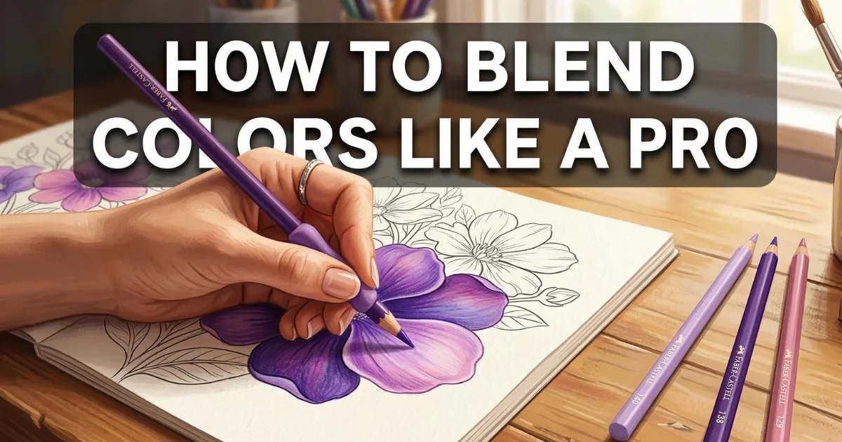
How to Blend Colors on Coloring Pages (Complete Guide)
Table of Contents
How to Blend Colors on Coloring Pages (Complete Guide)
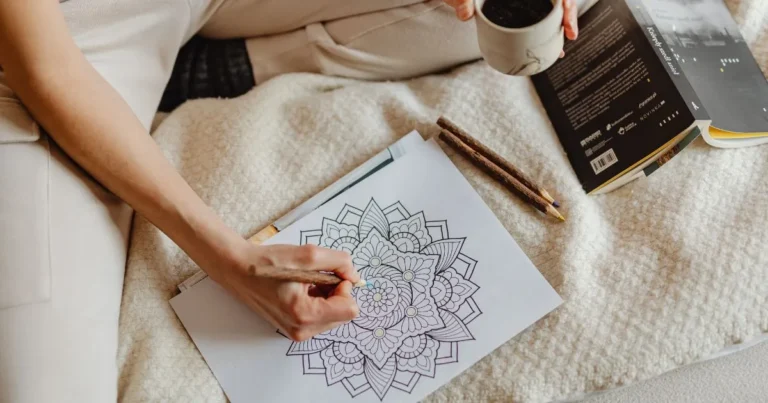
Have you ever looked at a beautifully colored page and wondered — how did they make the colors blend so smoothly? How did they create those gorgeous gradients, those soft shadows, and those rich layered tones that make a simple coloring page look like a piece of fine art?
The answer is not expensive supplies or natural talent. The answer is technique.
Blending is the single skill that transforms an average coloring page into something truly stunning. And the good news is that blending is completely learnable — whether you are picking up colored pencils for the first time or have been coloring for years and want to take your results to the next level.
In this complete guide you will learn exactly how to blend colors like a pro using colored pencils, markers, and watercolor pencils. We cover everything from the most basic beginner techniques to more advanced methods that professional colorists use every day.
Let us get started.
What is Color Blending and Why Does It Matter
Color blending is the technique of smoothly transitioning from one color to another — either between two different colors or between a color and white — so that there is no visible harsh line where one color ends and another begins.
Without blending a colored page looks flat and uniform. Every area is one single solid color with hard edges between sections. It looks like a child’s coloring book — which is perfectly fine for children — but for adults who want a more sophisticated result blending is essential.
With blending the same page transforms completely. Colors shift gradually from light to dark creating the illusion of volume and three dimensions. Transitions between colors are smooth and natural. The overall result has depth richness and a professional quality that makes people stop and say — did you really color that?
Blending also makes the coloring process itself more enjoyable. There is something deeply satisfying about watching two colors merge smoothly under your pencil into something more beautiful than either color alone.
Part 1 — Blending with Colored Pencils
Colored pencils are the most popular tool for adult coloring pages and the one with the most blending techniques available. Here is everything you need to know.
The Basics — Pressure and Layering
Before you learn to blend you need to understand two fundamental concepts — pressure and layering.
Pressure refers to how hard you press your pencil against the paper. Light pressure deposits a small amount of pigment and leaves the paper texture visible. Heavy pressure deposits more pigment and begins to fill the paper texture. For blending you will use a range of pressures — usually starting light and building up.
Layering means applying multiple thin layers of color on top of each other rather than one heavy layer. Layering gives you far more control and produces smoother more even results than trying to achieve full saturation in one pass.
The golden rule of colored pencil blending is this — always work light to dark and build up gradually.
Technique 1 — Burnishing
Burnishing is the most satisfying colored pencil blending technique and produces the smoothest most polished results.
How to do it:
- Apply your first color with medium pressure covering the area evenly
- Apply your second color on top with medium pressure in the transition zone where the two colors meet
- Now take a white colored pencil or a colorless blender pencil and apply very heavy pressure over the entire blended area
- The heavy pressure of the white or colorless pencil presses the pigment particles together filling all the paper texture and creating a smooth burnished surface
- The colors underneath merge into a smooth gradient
Best for: Skin tones, flower petals, smooth surfaces, backgrounds
Pro tip: Faber-Castell and Prismacolor both make excellent colorless blender pencils specifically for this technique. A white colored pencil works almost as well and is cheaper.
Technique 2 — Circular Blending
Circular blending is the easiest technique for beginners and produces beautifully smooth results with practice.
How to do it:
- Apply your first color using small tight circular strokes rather than back and forth lines
- Apply your second color in the same circular motion starting where the first color ends and overlapping slightly
- Go back into the overlap zone with the first color again using light pressure
- Continue alternating between the two colors in the overlap zone with light circular strokes until the transition is smooth
- The circular motion naturally mixes the pigments on the paper surface
Best for: Large open areas, backgrounds, organic shapes like clouds and skin
Pro tip: Keep your pencil sharp. A blunt pencil produces grainy uneven results. Sharpen frequently.
Technique 3 — Solvent Blending
Solvent blending produces professional results that look almost painted. It requires one additional tool — a blending solvent.
How to do it:
- Apply your colors with medium to heavy pressure layering generously
- Dip a cotton bud, a small brush, or a blending stump into a small amount of odorless mineral spirits or a dedicated colored pencil solvent such as Gamsol
- Gently work the solvent over the colored area using small circular motions
- The solvent dissolves the wax binder in the pencil and allows the pigment to flow and blend like paint
- Work quickly as the solvent evaporates fast
- Allow the area to dry completely — about 5 minutes — then add more layers on top for depth
Best for: Creating a painted effect, blending large areas smoothly, achieving professional results
Pro tip: Use odorless mineral spirits — regular turpentine has a strong smell and is too harsh. Baby oil also works as a gentler alternative.
Technique 4 — Gradient Blending
Gradient blending creates a smooth transition from one color to another across a large area — perfect for skies, backgrounds, and large flat surfaces.
How to do it:
- Decide which end will be your darkest color and which will be your lightest
- Apply your darkest color with heavy pressure at one end gradually decreasing pressure as you move toward the center
- Apply your lightest color with heavy pressure at the other end gradually decreasing pressure as you move toward the center
- The two colors should overlap in the middle with both applied at medium pressure
- Apply a middle color — a color that sits between your two main colors on the color wheel — in the overlap zone with light pressure
- Work back and forth between all three colors in the transition zone until the gradient is smooth
Best for: Skies, sunsets, water, backgrounds, large petals
Pro tip: For a blue to purple sky gradient use blue, then blue-violet, then violet. The middle color bridges the gap and makes the transition much smoother.
Technique 5 — Hatching and Cross Hatching
Hatching produces a more textured artistic blend that has a beautiful illustrative quality rather than a smooth painted look.
How to do it:
- Apply your first color using parallel lines — either horizontal vertical or diagonal
- Apply your second color using parallel lines in a slightly different direction overlapping with the first color’s lines
- The overlapping lines optically mix the two colors creating a visual blend
- Add more layers in different directions to deepen the blend
Best for: Fur texture, rough surfaces, artistic illustrative styles, backgrounds on detailed pages
Pro tip: This technique looks particularly beautiful on detailed adult coloring pages with lots of texture. It is faster than burnishing and has a distinctive hand crafted quality.
Part 2 — Blending with Markers
Markers produce bold vibrant colors that colored pencils cannot match. But they require a completely different approach to blending because the ink dries quickly.
The Golden Rule of Marker Blending
Always work wet into wet. Markers blend when the ink is still wet. Once the ink dries blending becomes very difficult. Speed is your friend with markers.
Technique 1 — The Wet into Wet Method
How to do it:
- Apply your lighter color first covering the entire area quickly
- While the lighter color is still completely wet immediately apply your darker color in the area where you want the darker tone
- The two wet inks will naturally blend at their meeting point
- Use the lighter marker to feather back into the dark area while still wet to soften the transition
- Work quickly and decisively — hesitation creates hard lines
Best for: Large areas, backgrounds, simple gradient effects
Pro tip: Work on one small section at a time rather than trying to color the entire page at once. This keeps the ink wet and blendable.
Technique 2 — The Colorless Blender Marker
Most marker brands sell a colorless blender marker — a marker filled with solvent instead of ink. This is one of the most useful tools in a marker artist’s kit.
How to do it:
- Apply your colors with markers as normal
- While the ink is still slightly wet apply the colorless blender over the transition zone
- The solvent in the blender pushes the ink pigments and blends them smoothly
- You can also use the colorless blender to create soft edges by dragging color outward from a colored area into the white paper
Best for: Creating soft edges, blending transition zones, lightening areas
Pro tip: Copic makes the best colorless blender on the market. Cheaper alternatives include the Winsor and Newton and Spectrum Noir blenders.
Technique 3 — Layering Light Over Dark
Unlike colored pencils markers can be layered to deepen color but cannot easily lighten. Always plan your marker coloring from light to dark.
How to do it:
- Apply the lightest color in your gradient first covering the full area
- Add the medium color on top leaving the lightest areas untouched
- Add the darkest color only in the shadow areas
- While each layer is still wet use the lighter marker to blend back into the darker layer
- Repeat until the graduation is smooth
Best for: Creating depth and volume, shading rounded objects
Pro tip: Choose markers from the same color family for the smoothest results. For example blend a light blue, medium blue, and dark blue rather than mixing very different colors.
Technique 4 — Alcohol Marker Blending on Smooth Paper
The type of paper makes an enormous difference with markers. Standard printer paper causes feathering and bleed-through. Smooth marker paper or Bristol board allows ink to flow and blend much more smoothly.
Best papers for marker blending:
- Copic marker paper — the gold standard
- Canson marker paper — excellent value
- Bristol board smooth surface — versatile and affordable
- Hammermill Premium Color Copy paper — a good budget option
Part 3 — Blending with Watercolor Pencils
Watercolor pencils are the most versatile and forgiving blending tool. They work dry like regular colored pencils and then transform completely when water is added.
Technique 1 — Dry then Wet
How to do it:
- Apply your colors dry just like regular colored pencils
- Use a clean damp brush — not dripping wet, just damp — to gently work over the colored areas
- The water activates the watercolor pigment turning it into paint that flows and blends naturally
- Work quickly with the brush while the area is wet to blend colors together
- Allow to dry completely before adding more dry layers on top
Best for: Soft dreamy blends, watercolor effects, nature scenes
Pro tip: Use a watercolor paper or at minimum 120gsm paper. Regular printer paper will buckle and tear when wet.
Technique 2 — Wet Paper Method
How to do it:
- Lightly dampen the paper area you want to color with a clean brush before applying any color
- Apply your watercolor pencils directly to the damp paper — the pigment will dissolve and spread immediately
- Colors applied to wet paper blend and feather naturally creating soft organic transitions
- Apply darker colors in shadow areas and let them flow into lighter areas naturally
Best for: Soft backgrounds, sky effects, atmospheric scenes, flowers
Pro tip: This technique is unpredictable in the most beautiful way. Embrace the unexpected results — they often look more natural and artistic than carefully controlled blending.
Color Theory for Better Blending
Understanding a few basic color theory principles will immediately improve your blending results.
Analogous colors blend most smoothly: Colors that sit next to each other on the color wheel — blue and purple, yellow and orange, red and pink — blend naturally and harmoniously. When in doubt choose analogous colors for your gradients.
Complementary colors create mud when over-blended: Colors opposite each other on the color wheel — red and green, blue and orange, yellow and purple — can create beautiful contrast but if over-blended in the transition zone they produce a muddy brown. Use them for contrast rather than smooth blending.
Always add a middle color: When blending between two colors that are far apart on the color wheel add a third middle color in the transition zone. For blue to yellow add green in the middle. For red to blue add purple. The middle color acts as a bridge and prevents muddy transitions.
Value matters more than hue: Value means how light or dark a color is. For convincing depth and volume the most important thing is not which color you use but how you vary the value from light to dark across a surface.
Common Blending Mistakes and How to Fix Them
Mistake 1 — Starting too dark: Many beginners apply their darkest color first and then cannot lighten it. Always start with your lightest color and build up gradually.
Mistake 2 — Pressing too hard too soon: Heavy pressure fills the paper texture immediately leaving no room for additional layers. Always start with light pressure and increase gradually.
Mistake 3 — Using a blunt pencil: A blunt pencil produces grainy uneven color that is impossible to blend smoothly. Keep your pencils sharp — sharpen after every few minutes of coloring.
Mistake 4 — Rushing the process: Good blending takes time. If you rush you end up with hard lines and uneven transitions. Slow down and enjoy the layering process.
Mistake 5 — Too many colors: Beginners often reach for too many different colors. Start with just two or three colors per area and master blending those before adding more.
Mistake 6 — Wrong paper: Standard printer paper has a rough texture that fights against smooth blending. Invest in proper coloring paper — even inexpensive cartridge paper produces noticeably better results.
Recommended Supplies for Blending
Beginner Budget:
- Faber-Castell Classic colored pencils 36 set
- Staedtler triplus fineliner markers 20 set
- 90gsm white cartridge paper
- Colorless blender pencil
Intermediate Kit:
- Prismacolor Premier colored pencils 48 set
- Copic Sketch markers — start with 12 grays plus your most used colors
- Canson marker paper pad
- Odorless mineral spirits for solvent blending
- Small flat brush for solvent application
Watercolor Addition:
- Faber-Castell Albrecht Dürer watercolor pencils 24 set
- Arches watercolor paper cold press 140lb
- A set of round watercolor brushes sizes 2, 4, and 8
Practice Exercise — Your First Blended Gradient
Try this simple exercise before working on your next coloring page:
- Take a blank piece of paper and draw a simple rectangle about the size of your hand
- Choose two analogous colors — for example light blue and purple
- Apply light blue with light pressure filling the left two thirds of the rectangle
- Apply purple with light pressure filling the right two thirds of the rectangle — it will overlap with the blue in the center third
- Go back into the overlap area with light blue using very light circular strokes
- Then go back with purple using very light circular strokes
- Repeat steps 5 and 6 until the transition is completely smooth
- Burnish the entire rectangle with a white pencil or colorless blender
Congratulations — you have just created your first professional gradient. Now apply this same process to your next coloring page.
Frequently Asked Questions
What is the easiest blending technique for absolute beginners? Circular blending with colored pencils is the easiest technique to start with. It requires no extra tools and produces good results with practice. Start with two analogous colors on a simple shape and practice until the transition feels natural.
Do I need expensive colored pencils to blend well? Good quality pencils make a noticeable difference but you do not need the most expensive options to start. Faber-Castell Classic pencils are affordable and blend well. Prismacolor Premier are a significant step up and worth investing in once you are ready to take your blending to the next level.
Can I blend with regular crayons? Yes to some extent. Crayons can be burnished together using the same technique as colored pencils. However crayons have a much waxier texture and less pigment density so the results are less refined. Colored pencils produce significantly better blending results.
How do I blend without a colorless blender pencil? A white colored pencil is an excellent substitute for a colorless blender. Odorless baby oil applied with a cotton bud also works beautifully as an inexpensive solvent blending alternative.
Why do my colors look muddy when I blend them? Muddy results usually come from blending complementary colors — colors opposite each other on the color wheel. Switch to analogous colors for smooth clean blends. Also ensure you are working light to dark and not over-blending by going back and forth too many times.
How long does it take to get good at blending? Most people see significant improvement within two to three dedicated practice sessions. The key is intentional practice — work on blending specifically rather than just coloring pages. Focused practice on gradients and transitions for even 30 minutes will produce noticeable results.
Pick up your pencils and start blending — your best coloring pages are still ahead of you. 🎨
— Lina, Daily Coloring Pages